Vasari Oil Paint

Vasari oil paint.

Words, certainly have little power to describe nuance of color or its emotional effect. It is the language of the eye. The visual world as described by light from a star burning millions of miles away. Never the less its what we have to translate thought and emotion. A tool to record direction, theory, and general speculation on the matter. Vasari oil paint is best understood by playing with the paint itself and in doing so will reveal just how special it is.

Vasari is a small paint manufacturer based out of Easton, PA, run by Stephen Salek and Gail Spiegel. The paint is made in America, in small batches and even tubed by hand. Available only through website as it is a direct to consumer based model, and it suits them down to the bone. If you have a question, check out their blog or the many videos of Gail mixing colors and going into great depth on different properties of the pigments.

I have spent my entire life playing with paint. I started using artist grade paints as a small child with my grandmother(who was a fine painter herself). Over the years I have tried many of the top paint brands and have observed the markable differences between them(pigment load, body, rheological properties). After working at the local Blick for a couple of years, my whole hearted opinion was that the artist should pick hues of certain pigments that they enjoy the most and not be afraid to switch around from paint maker to paint maker. That hand ground paint was always the nicest. That the really high-end manufacturers were pedaling snake oil. After trying Vasari my opinions have fundamentally changed. The feel of the paint out of the tube is unparalleled. Smaller colourman like Vasari bring something special to artists, and create a paint that is just about devoid of all additives. it is the closest thing to hand ground that I’ve used, and it makes those paints look a little lack luster as they will manipulate grind size depending on the pigment. I am now a believer that one is best off using paint that has similar body.

Everything about Vasari emits class and a temperament for beautiful design. The boxes the sets and selections of eight come in, provide a single cut out per 40ml tube. They arrive completely unscathed awaiting their duty. They put this care into even singular tubes, which are sent in their own cardboard box wrapped in an abundance of bubble wrap. The aesthetics of the tubes with their raw aluminum, off white paper labels, and hand trimmed warnings are so beautiful that just having them around is proven to increase mood and productivity.

Buy some of their paint. It’s magic.

love.


Italia For the Summer

My wife and I got married November of 21’ and to mark the occasion we decided to take our honeymoon trip to one of our favorite places, Florence, Italy.

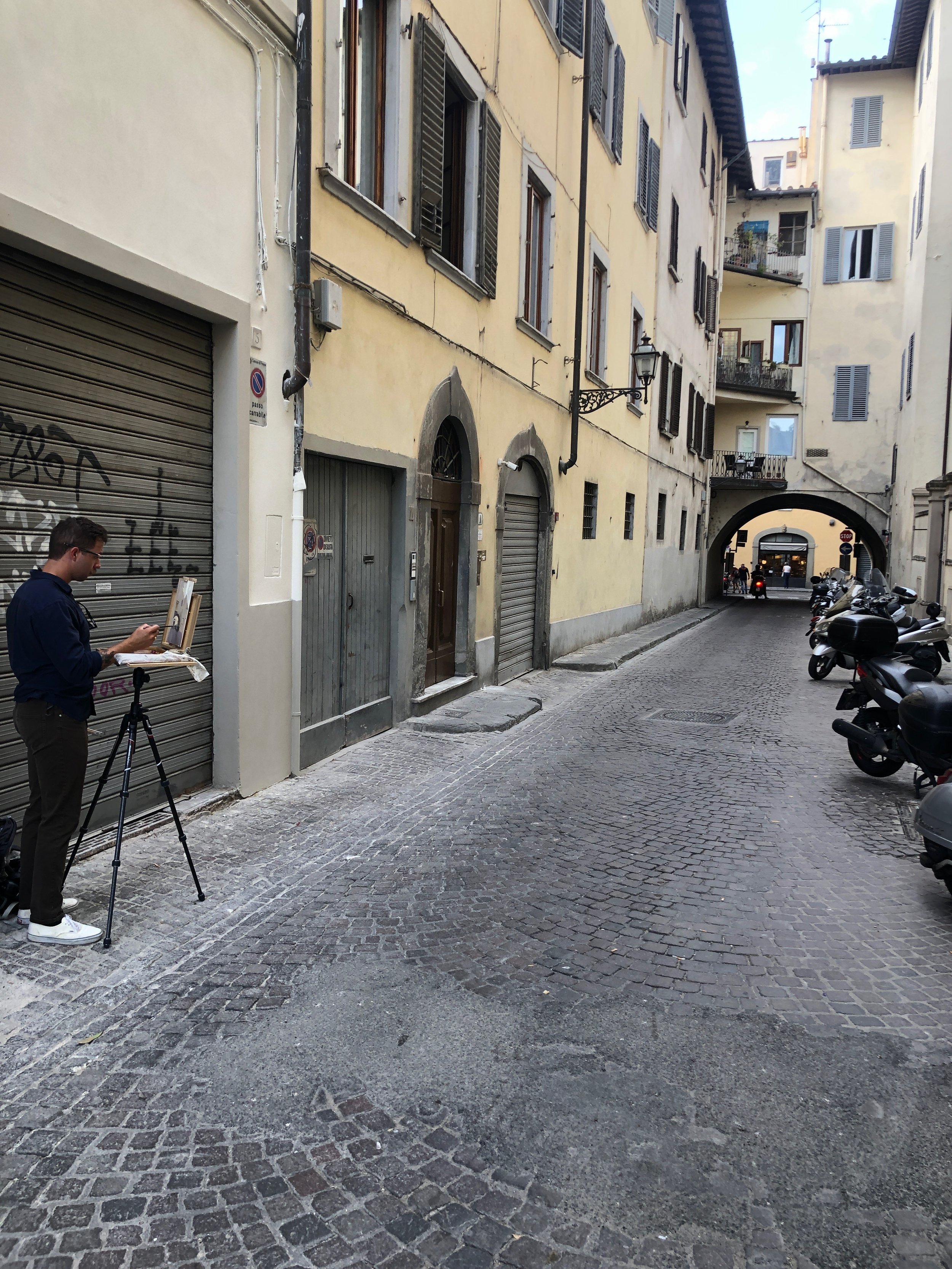
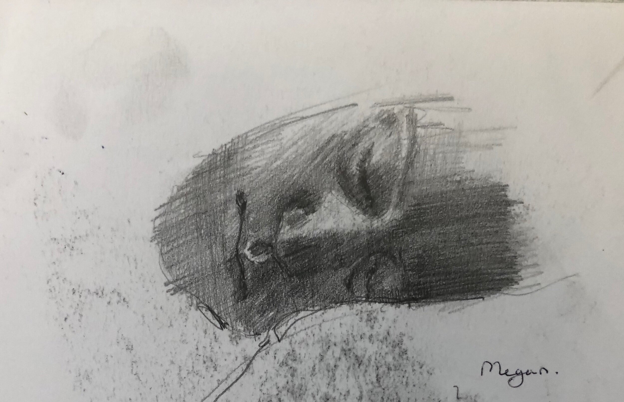
Florence is a city that holds on to its past and cherishes it. It invites all with a romantic disposition to come and take part and bask in its beauty. Megan and I’s first time there together was in 2016 during a three month trip abroad. We stayed there over a month and used the time to study some figure drawing and painting at the Russian academy in Florence. It was October, we were in love, we drank lots of wine, had pizza as frequently as our budget would allow, and drew and painted our way through and around the city.

We opened up and it changed us.

That trip reformed my inner compass and helped shape my sensibilities in a profound way. It is one of the only places that when I get off the plane or train I think, “I’m home.” Since then we have been back twice, each time refreshing our spirits in the proverbial creative fountain of youth that is Florence. Retracing the steps of the Renaissance legends, the Macchiaioli, Sargent, and Annigoni(to name a couple) to try to imagine the world they must of lived in. To think about how much things have changed since they’ve gone. How much is the same?

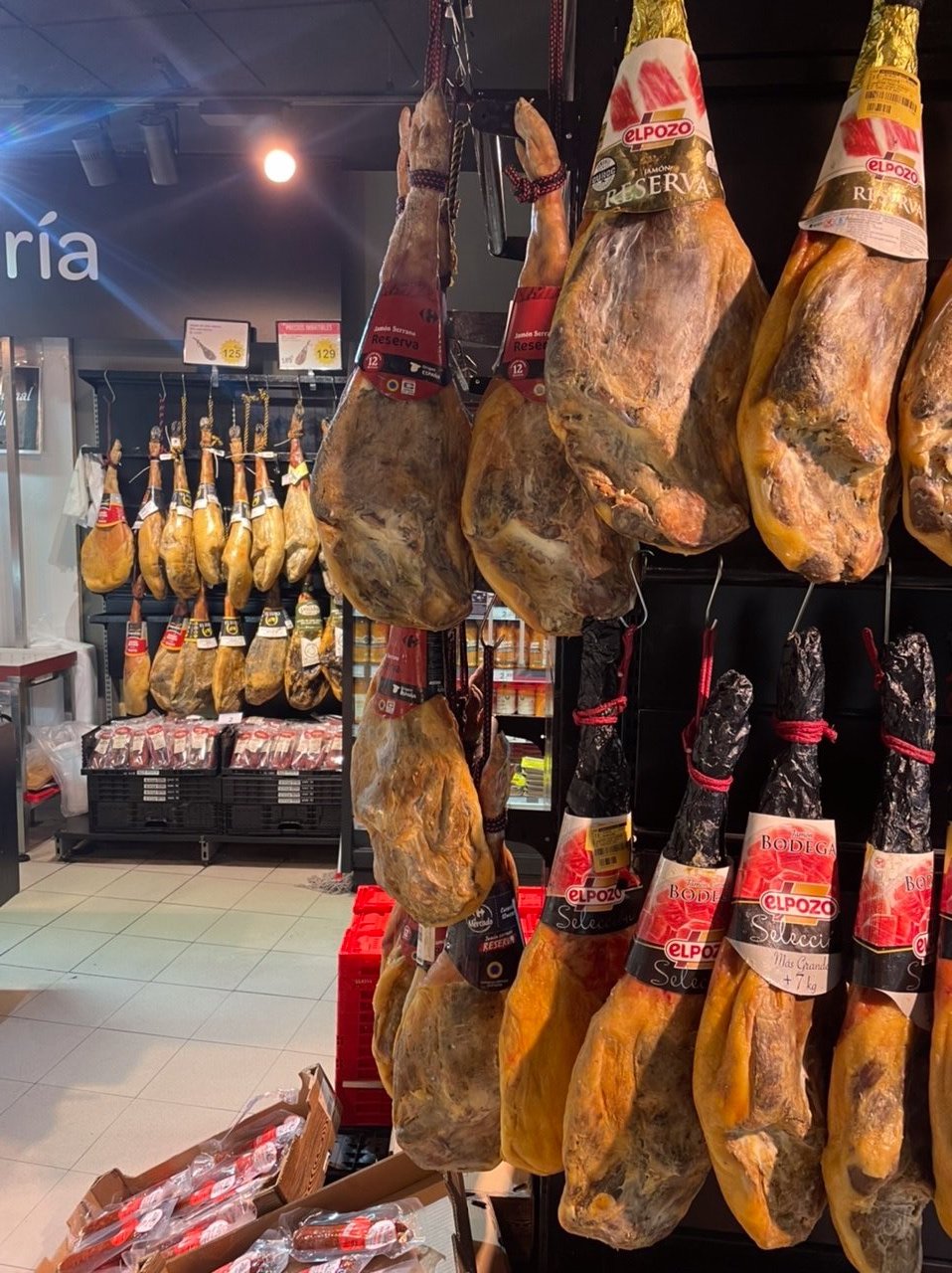
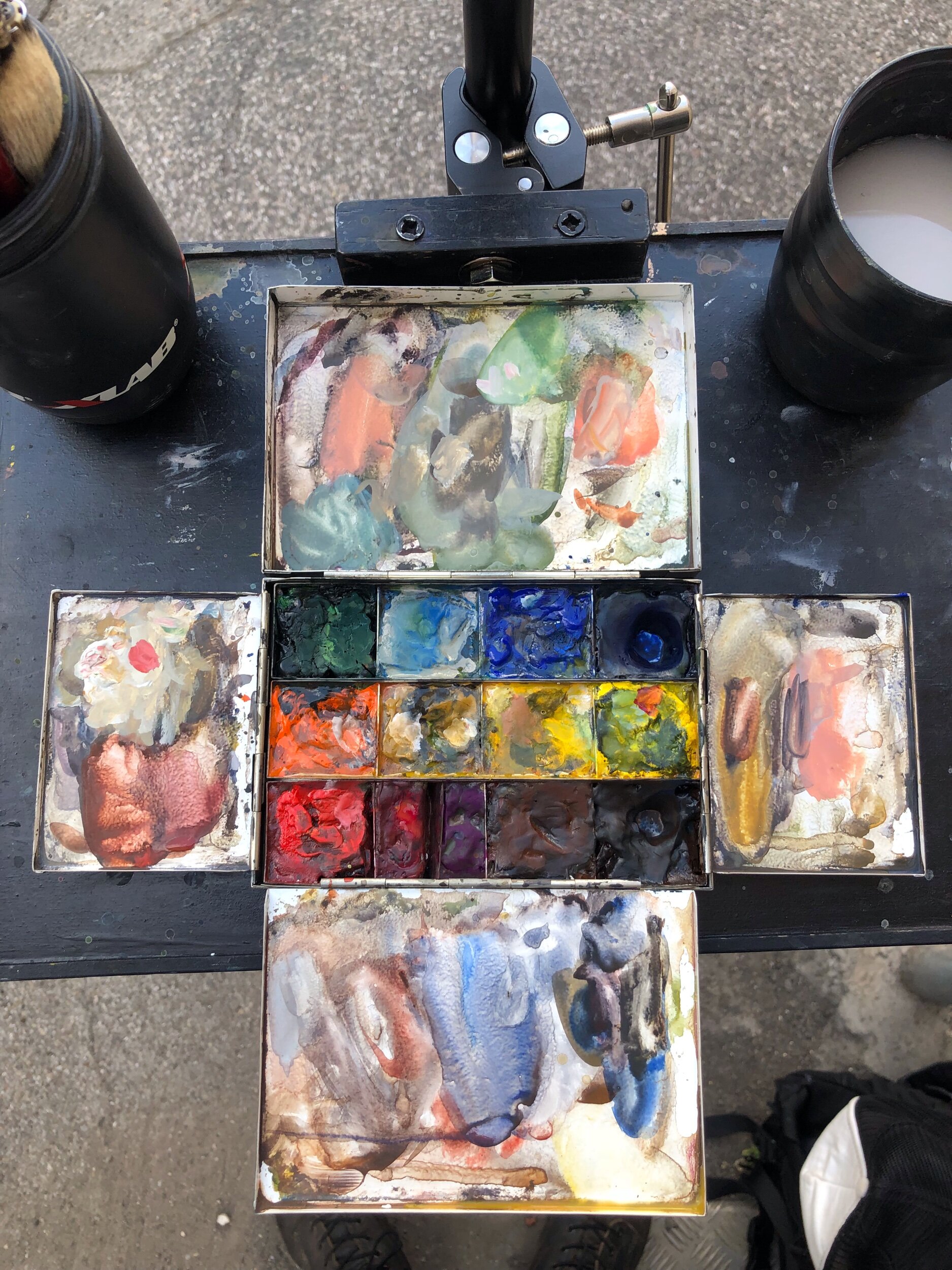
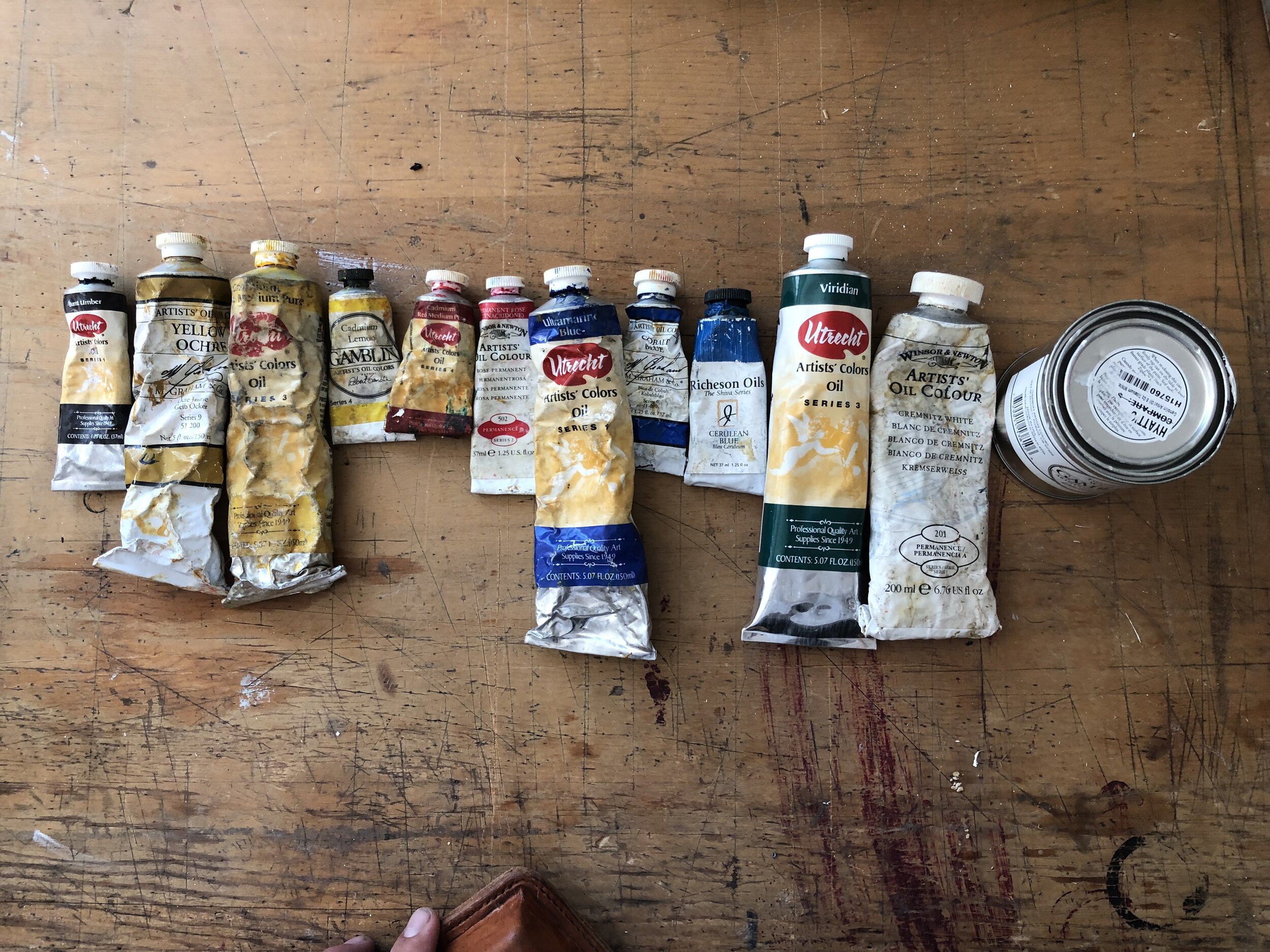
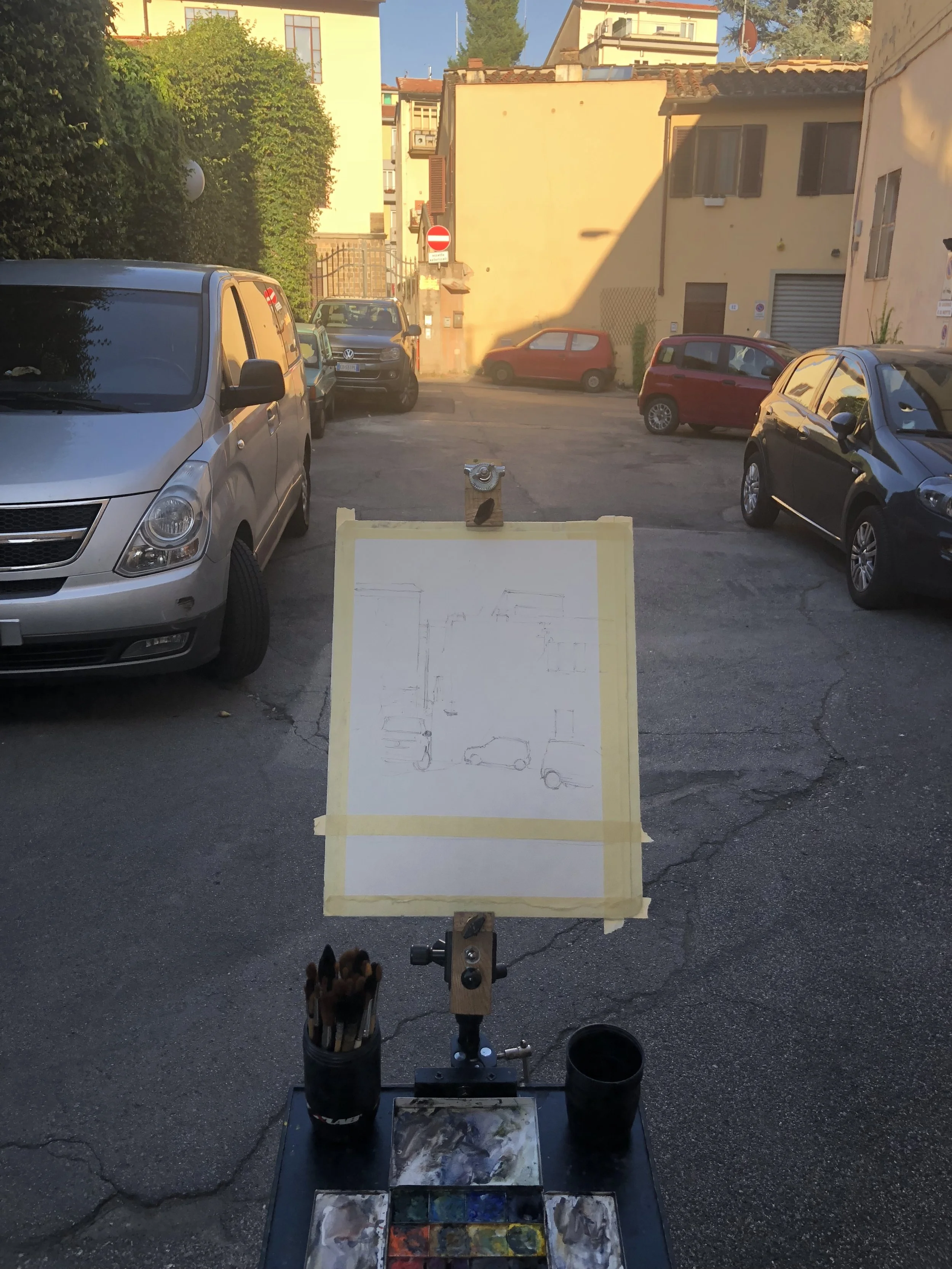
This summer we rented a little apartment off of Via Giampaolo Orsini. This area was ideal for us to call home whilst there, as it was an easy fifteen or so minute walk to the city center. We did all of our favorite things: Paint, drink coffee, workout, explore, museum hop, people watch, and by God, drink too much wine…

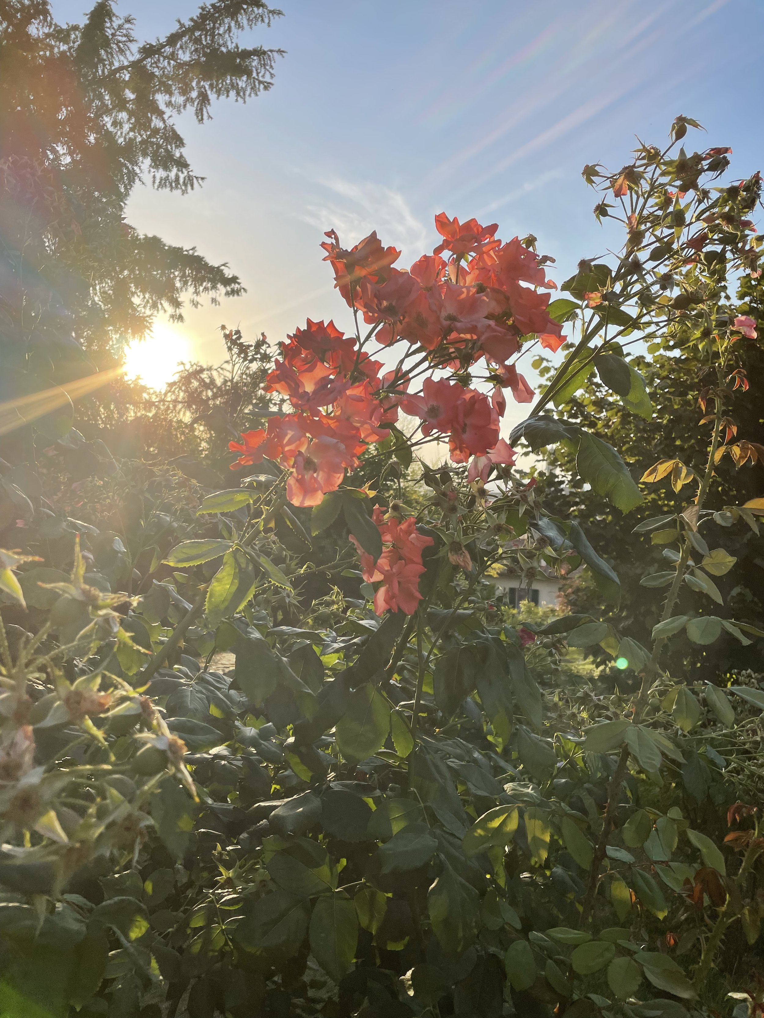
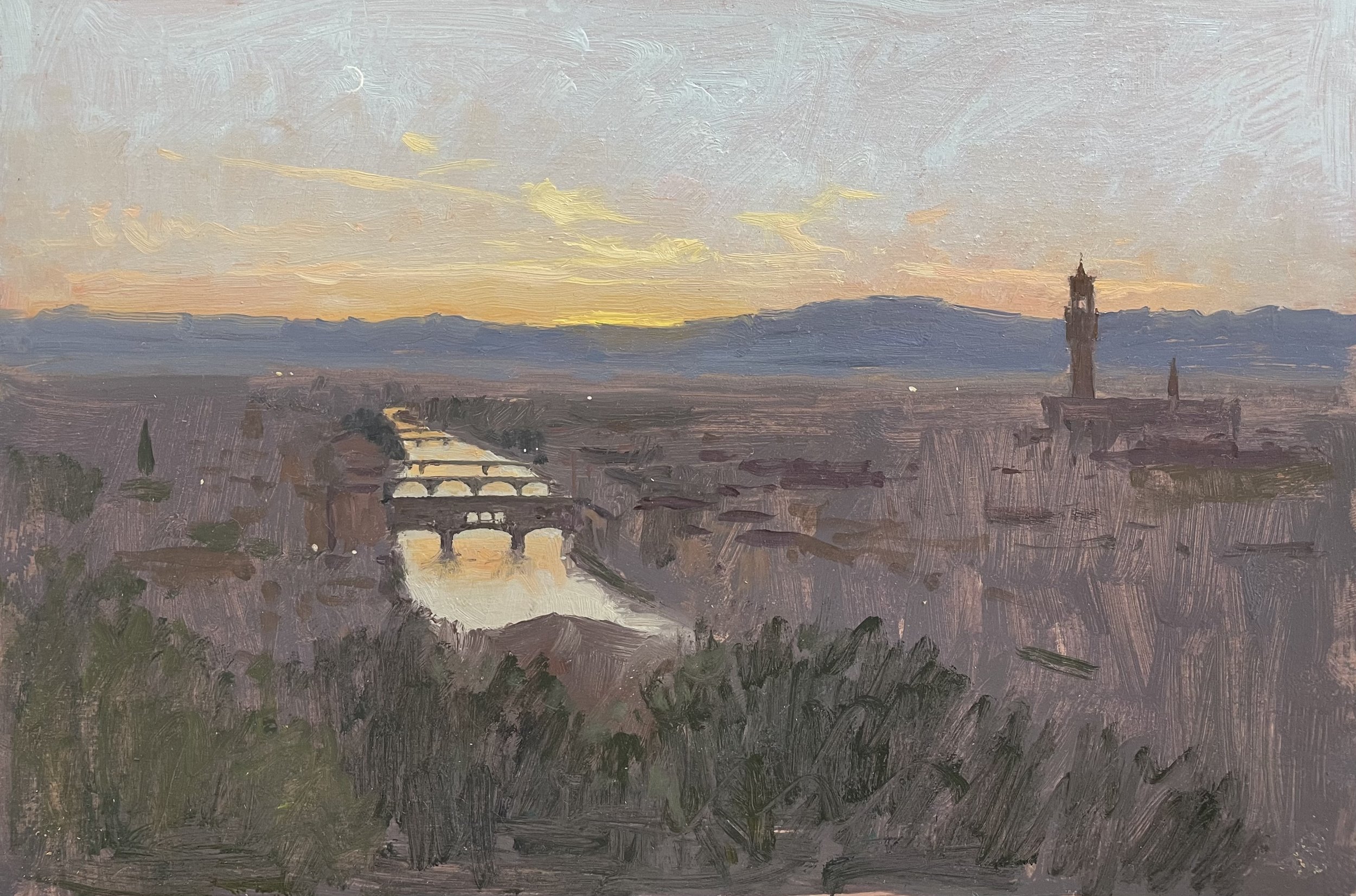
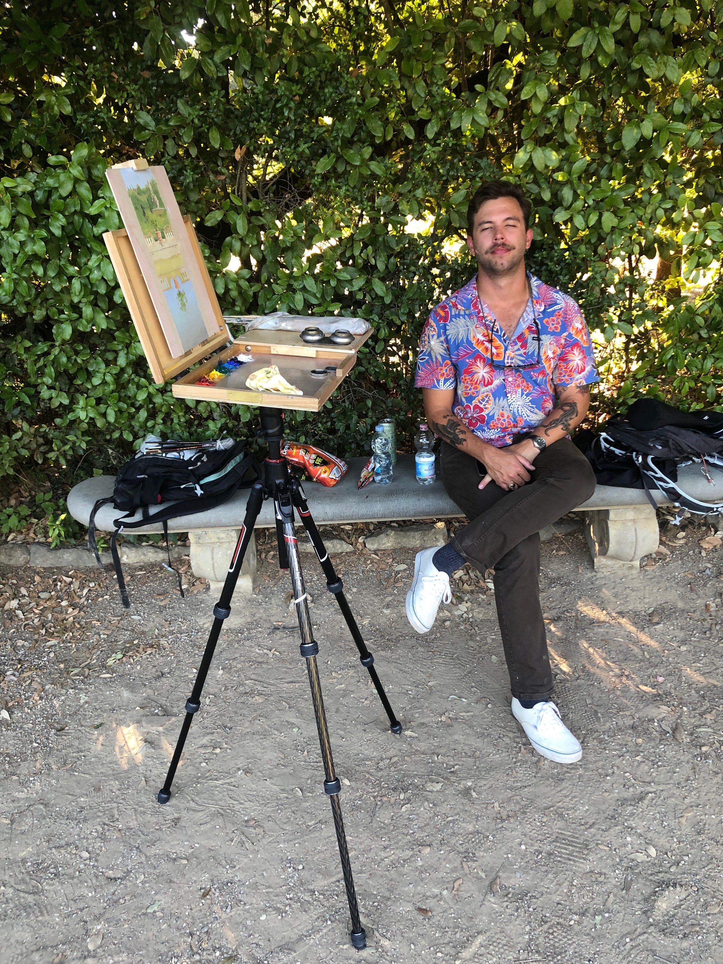
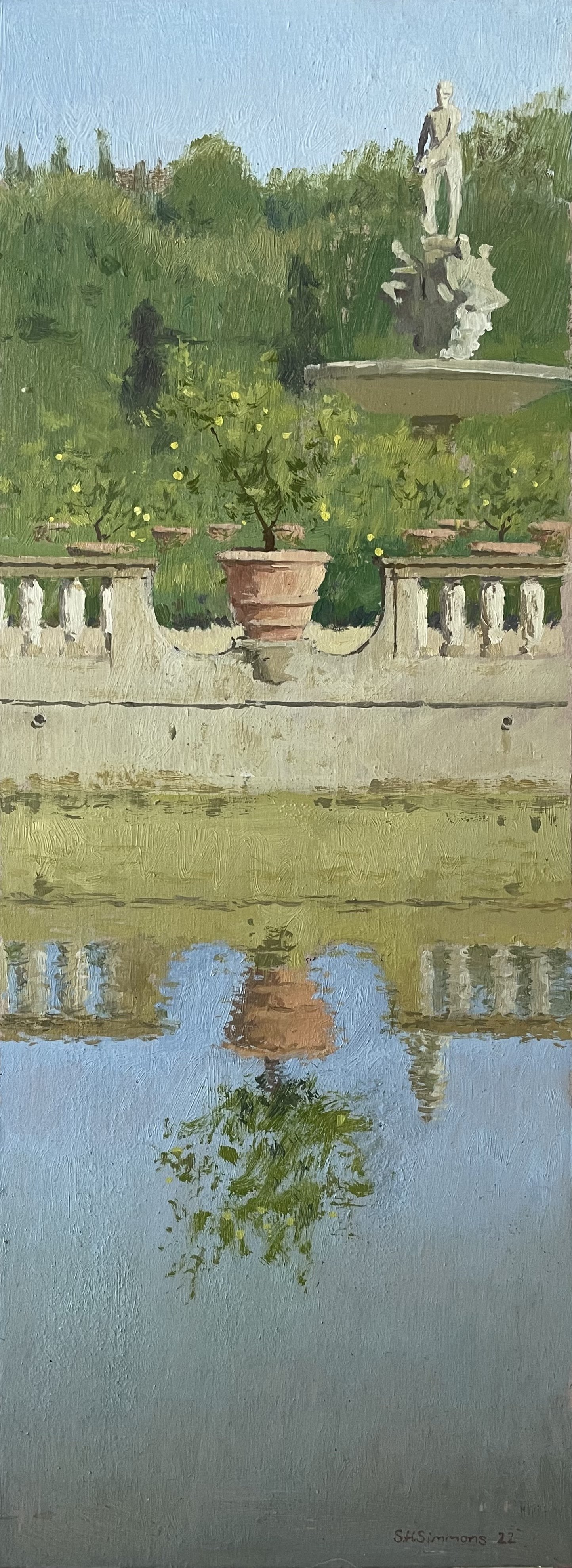
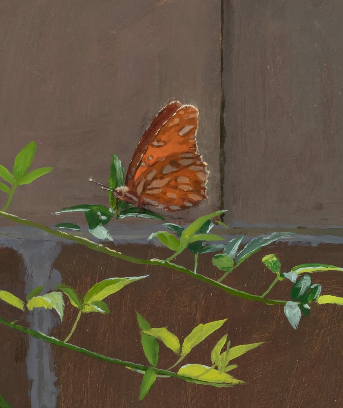
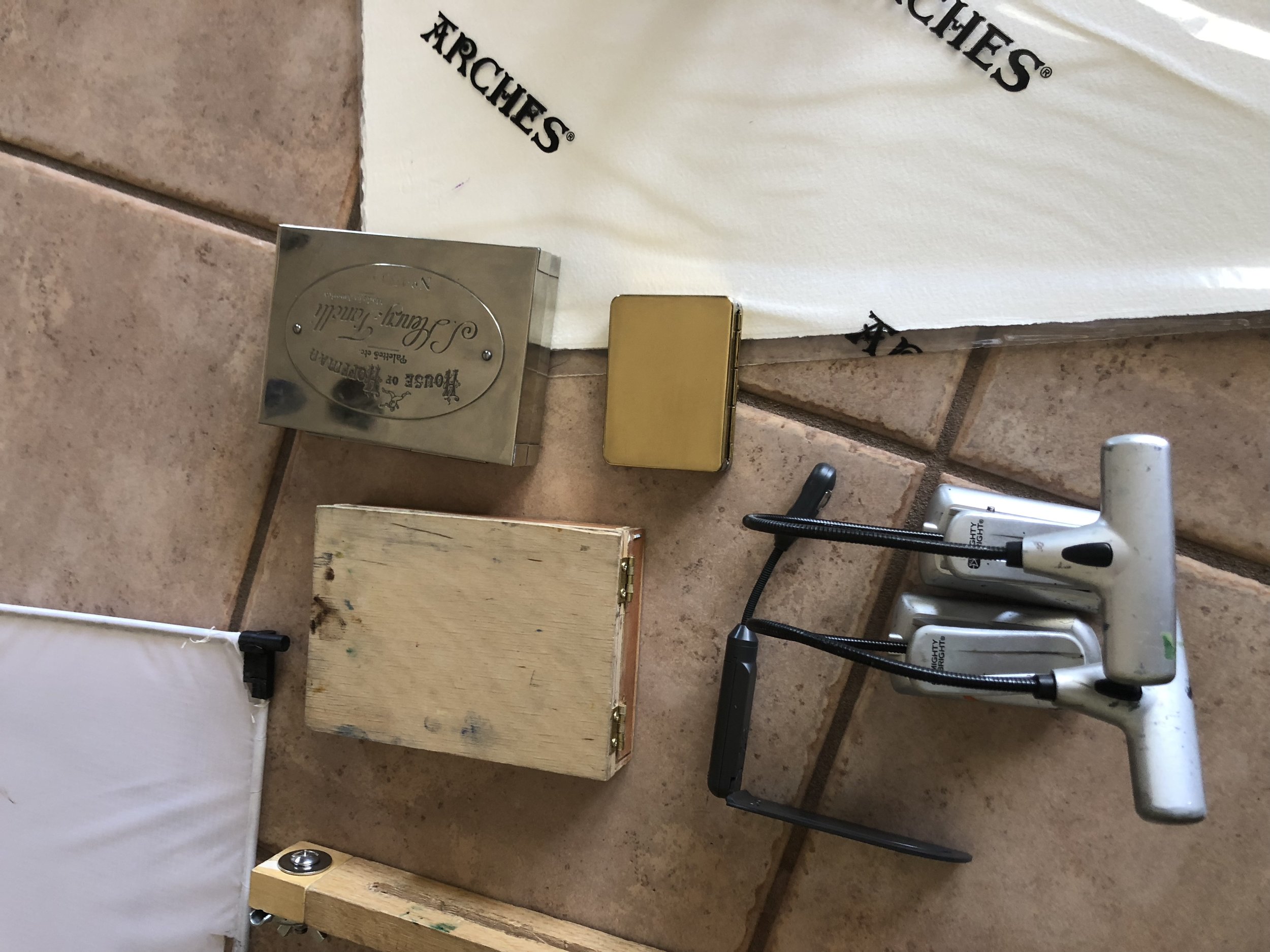
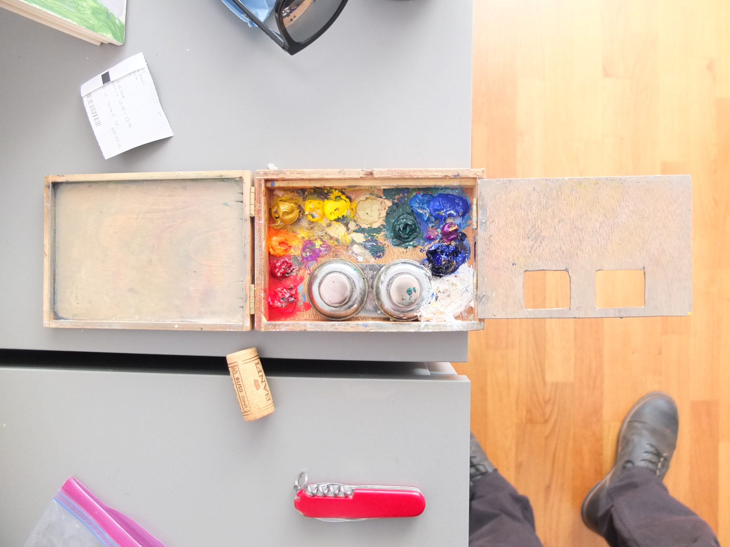
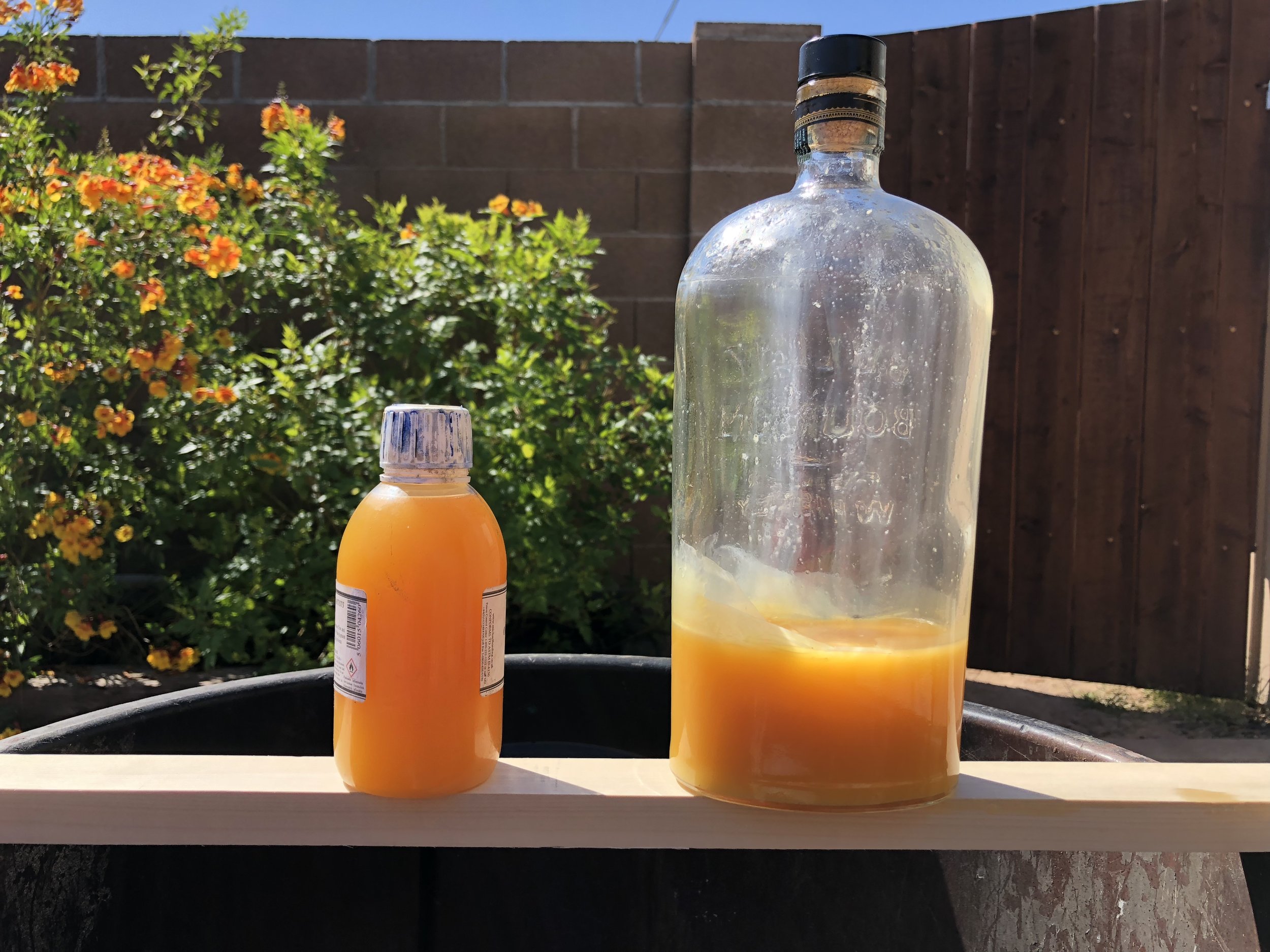
We made it a point this summer to see some things that we hadn’t before(which isn’t hard to do), like the Rose Garden, which is a beautiful spot to paint and have a few glasses of wine in the evening or even mix up a couple of Negronis in a bottle or a limoncello spritz for cocktails(there is in fact bagged ice in Italy available at the stores, its Ghiaccio). One of the more delightful things about Europe in general, is that you can disappear in the seas of tourists. No one notices the man or woman indulging in a a glass of wine with a cobbled together charcuterie board sitting on a step or a bench in the park. There is a definite “laissez faire” attitude towards public smoking and drinking in most large European cities that I rather enjoy. Which furthers my belief that no cafes stand up to the magesty and love of an impromptu happy hour that I can carry in my backpack. Word to the wise, bring the Swiss Army Knife with the wine bottle opener.

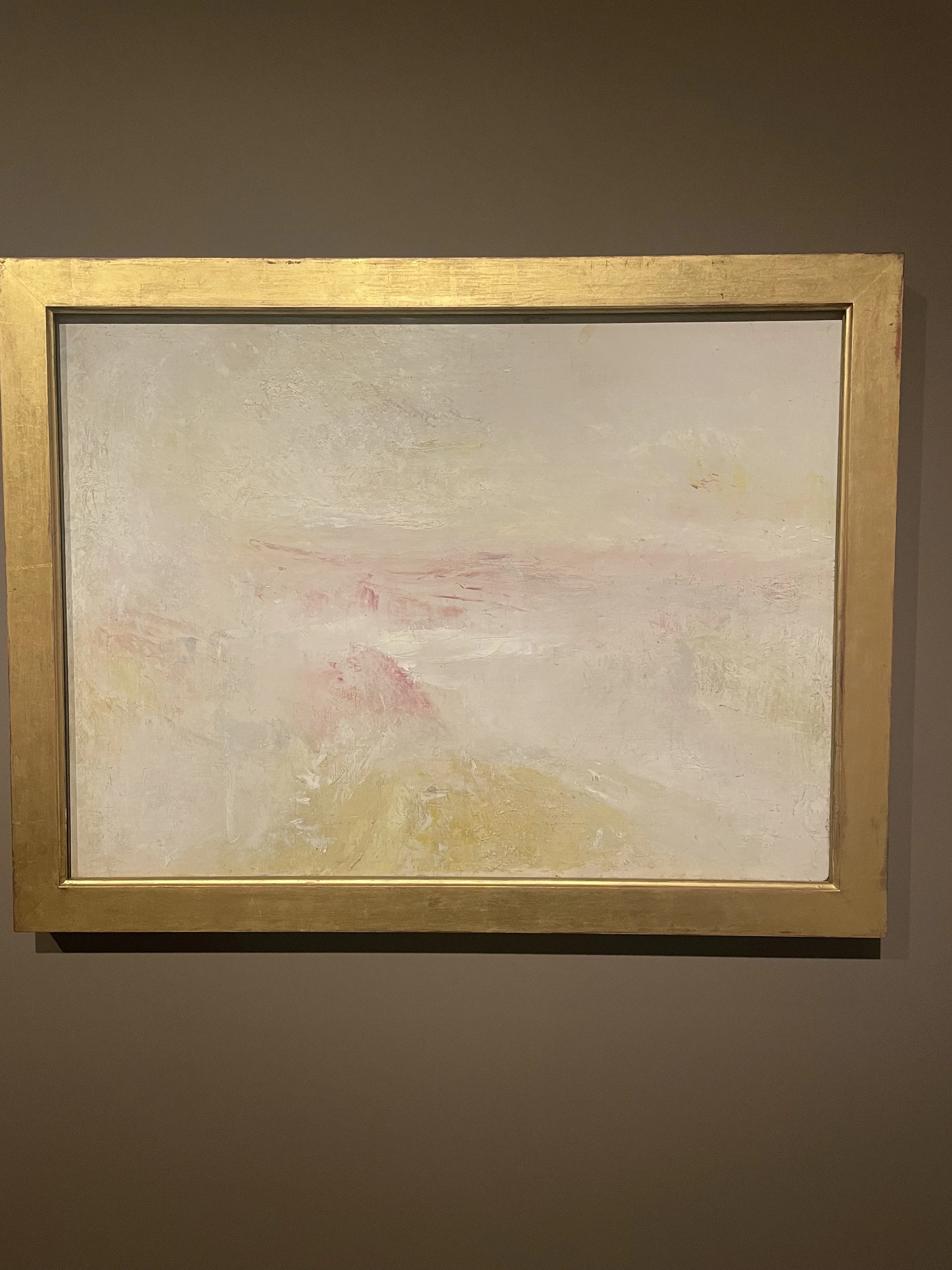
Some highlights of the trip for me (besides living in Italy with my wife), were: A lecture on Sorolla by Tom Richards(Florence Academy), the Sorolla show in Milan, the Donatello show at the Palazzo Strazzo, making friends with new and incredible people(Delfina), our day trip to Cinque Terre, sunset cocktails at “House of the People” in Fiesole, our trip to the Prado, and especially the absolute surprise and wonder that was the Museu Nacional d'Art de Catalunya and the Turner show that was on display there(the large Fortuny painting hanging there is worth the flight alone from wherever you are in the world).

If you ever get a chance to go to Firenze, stop in at Zecchi, and spend the day walking down every street you can manage. Stop for a Negroni or two. Eat the whole pizza. Have an espresso. Bring some one you love. Be present.

It’s a fine place to measure yourself up to the giants, but eventually you just have to get on with it.

Until next time.

“Summertime Jasmine.” Whatever the EU equivalent to 12x16 inches is. Oil on a Zecchi gesso panel. The smell of Jasmine reminds me of all things wholesome and good. My home in Phoenix, spending time in Firenze, and of course spending time down at our family home in Mexico.

Jamon in Madrid.

Wall of Pigments at Zecchi’s

Fortuny’s micro paint box at the Museu Nacional D'art Barcelona. Must have been like 6x8 inches. I get so much joy from all aspects of art, from the finished work to brushes and palette box.

Room for three wet panels.

Turner’s sketchbook at the Museu Nacional D'art Barcelona in their Turner exhibition. I have long been a great admirer of all of his sketchbook work. To see the way he would come up with his source material and then actualize it in to large, finished paintings always brings a smile to my face. No photos here.

Massive Work at The Museu Nacional d'Art de Catalunya, Barcelona by Fortuny. It was truly a surprise and completely floored me. “The Battle of Tetuan,” 3 x 9.72 meters. The painting would prove to be Fortuny’s largest most ambitious painting that he would sadly never get around to finishing. Much of Fortuny’s work is very diminutive in size and very detailed and lively. To see this paintings and see how he managed to retain that sense of detail and life in the work was impressive. I also can sympathize with him as someone he tends to work much more comfortably at a smaller scale I have a couple works that are taking years because I can lose momentum and get distracted by another work.

Turner.

Turner.

A rare public siting of a work by Antonio Lopez Garcia at the Museu Nacional d'Art de Catalunya, Barcelona.

More Fortuny.

Fortuny.

Stained glass, and the displays of Gaudi’s design works and others working in his tutelage made this museums one of the most inspiring I’ve ever been to. Green being a favorite color of mine, the wall color was very comforting and countered the warmth of the wood and Bronze works displayed.

Landing in Firenze, Italia. The Duomo.

First Cappuccino and pasticcino in Florence.

Beer.

Painting with Megan on the Arno at night. The Ponte Vecchio will always be a wonderful motif.

Evening at the Rose Garden.

Painting in the shade during the hot summer Florentine days.

Church in Fiesole.

Midday Shadows.

Last light over Florence and the Arno.

Painting at the Piazza Michelangelo. Painting shoulder to shoulder.

Professional photo shoot with a photographer from Flagstaff, AZ. A small world.

Details from the Cathedral in Milano.

Sorolla exhibition in the Palazzo Reale. A mammoth show spanning the artists life. Amazing to see the change in his work over his career. Certainly a fantastic painter from a young age. You can see the leap where he starts painting out of doors on a large scale and bringing powerful everyday life narrative that the paintings become iconic. One will always compare themselves to Sorolla and aim to paint larger. To reach. That was my take away. Also, on a technical note, I really enjoyed seeing how much cobalt violet he was using in his later works. The violet permeated through the works all over and created a real sense of warmth.

David, Michelangelo.

Botticelli at the Uffizi.

Botticelli.

Pizza at Affe di Bacco. Tremendous.

Vernazza, Italy.

Pizza at Mangia. Original, small and intimate spot. The owner makes the pizzas, and he is amazing. He has a fiery disposition and great pride in his work.

Donatello show at the Palazzo Strozzo in Florence. Transcendent. The man was a genius.

Decorative ornamentation. I wish the western United States had more beautiful architecture and tasteful details. This was at our more modern Apartment complex.

Summer Daze at the Boboli Gardens.

Getting flooded out of spot in Venezia. Cheers!

Springtime in Her Garden

My studio is at my childhood home now. There was an original one car garage that opened to the alley, and a couple of years ago I spent three or four months completely renovating it to be a year round work space. One of the things that appeals to me most is painting the things I know. I dive deep into reflection over side yards, plants, canal ways, fallen trees, dead birds, and the many other things that are in my everyday existence. I love knowing the background of every part of the painting, from materials I use, what trees a bird fell from, or what year a house was built. It is layered into the finished work.

Painting at and near my childhood home brings back all my early memories of happiness and fear but most importantly I think it puts me in that feeling of timeless wonderment. Watching bugs crawl across leaves, wasps land in the pool for a drink, and that endless hum of the air conditioners. It is a time capsule and I am merely here to observe and record.

For this painting I returned to a lady banks rose my mother and I planted three years ago. It has been an unspoken goal of mine to return to it each spring to capture its beauty as it matures. This in now my third finished painting I have completed from life over many weeks. Each time I begin with wonder and excitement and end with feelings of being overwhelmed be the amount information I’ve recorded. As the rose bush grows in size I will try and push the scale of the work to encapsulate more of it.

The pieces all start some time in late February or middle of March. This year I put some finishing brush strokes on at the end of August. The honeymoon to Italy is to blame for this extremely drawn out span of time, but I always try and finish the piece when it wants to be finished. Always in the back of my head, is “make it better…” and with that in mind I work the thing until I think I can’t make the thing any better. Thankfully when one is working from observation and studies from observation you are limited by mother nature herself. For instance when returning to the piece some two months and change later, the rose bush had doubled in size and of course was devoid of all blossoms. Just an insight into how some of these pieces come together. All tools one has cobbled together over the years come into play. Drawings, watercolors, sketches, and many hours and days working directly from life. The only authentic way for me to work.

I may now put up a few images of the painting, but I shutter to include images of what the actual scene I worked from looked like out of pure disdain for constant comparison to photography. Thank you for stopping by and feel free to send me an email about painting things.

“Springtime in Her Garden,” Oil on Linen Mounted to ACM Panel. 24 * 36 inches.

Detail of the orange Gulf Fritillary butterfly. Megan found the butterfly whole, so I glued it to a dowel and painted it in. Love these beautiful creatures.

The painting resting wonderfully on my new companion, the Gloucester easel by “Take It Easel.” They are based out of Vermont and made by hand out of American Maple and If you have any interest in painting out of doors and large, this thing is tool. It is bomb proof and will hold up to some serious wind.

New "Little Brass Box" Watercolor Palette

Well over a year ago, I drunkenly put down a small deposit for a handmade brass watercolor box made by John Hurtley at “Little Brass Company,” in England. The box is truly a work of art, all the little imperfections in the soldering reminds you this is made by hand, and damn well.

The palette is the Binning Monroe. The box is actually a popular reinterpretation of the original Binning Monro box made in England at the turn of the century. I have a micro palette since 2016 that was made by John as well. The box has served as a stalwart companion for many sketch books and small paintings over the years and I suspect, God willing, many more.

Did I need another palette box? Of course not. I was thinking about the box as function rather than need. I really like large wells and mixing area as well as the overall layout of the box. I really value beautifully made things in my life, in every facet. Painting gear takes precedence in most cases as it is both my profession and obsession. All that being said the small German nickel palette made by Steve Fanelli over at “House of Hoffman,” packs a huge punch. It is battle worn from constant companionship since I believe October of 2014. It has been around continental United States many times as well as Europe, Canada, Mexico, and Costa Rica. It has been dropped, reformed, and modified by Steve. It is better and more beautiful than the day it showed up in the mail. The craftsmanship is unmatched, and undoubtedly will see me to the end of my life and continue on to my children.

Enough of flapping of gums, pictures are what you have come for, and it is what you shall receive.

The two palettes next to each other for comparison.

Open, you can see there is a pretty monstrous amount of room to play with paint on the “Little Brass Box.”

A tantalizing close up of box “150.”

Workshop 2021

Exciting news! I will be teaching a couple of workshops starting November of 2021!

The first, will be a pleinair watercolor workshop. I will be taking a group of students around town (Phoenix, Scottsdale) to paint on location. The class will go from 1-4pm for three Thursdays from the 4th-18th of November. We will cover the whole gamut of painting out doors in the medium. I intend to make it as thorough a class as I can!

The second is a oil painting workshop with a similar focus. Painting local scenes outdoors and exploring the beauty of oil paints. It will cover a huge array of techniques, materials, philosophy and general practicalities while painting outdoors. Painting locally gives us the opportunity to seek out beautiful and intriguing subject matter in our backyard. The class will take place 9am-4pm on March 11, 2022.

I have always looked forward to a day when I could pass on some of the knowledge that I’ve fought hard to obtain over the years. Painting has always been and will continue to be a magical mystery to me. There is certainly an allure to looking back at the masters and thinking they had special mediums, brushes, or so on and so forth. The truth is, everything available then is available now, and in spades.

Education and practice are at the top of the priority list for those seeking to master representational drawing and painting. Though nature is our greatest teacher, one will often spend years or decades deciphering lessons which may have only taken a short demonstration by a competent instructor. My goal for these classes is not to pretend to be an absolute, but rather a Sherpa guiding those who dare to one of the many false peaks on their way to mastery.

hopefully some of you will sign up so we can go and paint together!

Summer Traveling…

Or lack there of.

My girlfriend Megan, and our dog Otis have not nearly gotten in enough traveling and adventure this summer. I understand we are having a global pandemic and the responsible choice is to stay put and isolate. That is what we have been doing for months. As August quickly approaches we are packing up the car and are getting ready to travel too a cross our beautiful country to South Dakota. Megan has family there, and it just so happens to be one of the most beautiful places I have ever been.

So I begin the long process of making sure I have an absolute abundance of painting materials for the month long adventure. I always have a tendency to bring way too much stuff, but when you go to smaller towns the opportunity for readily available high quality materials becomes diminished.

Sending you all love and light. I hope you are safe, and staying busy in these odd, and uncertain times.

S.H.Simmons

New Watercolor Palette

Recently got my palette back from the myth and legend known as Steve Fanelli. One of the worlds finest craftsman. He has a one man operation known as House of Hoffman based out of Michigan. Making perhaps the finest watercolor palettes on the planet with brass and German silver. I purchased mine in 2015 I believe, and have been using it obsessively ever since. I have sent it back before for a cleaning and to be bent back into shape because of a nasty spill it took while out painting.

I sent it in to have some new paint wells made to accommodate 10 instead of 12 colors with a small mixing well in the center. As I paint more I realize I use less colors and I am just kind of tired of them taking up space and weight. Here are a couple of images before and after.

Thank you for looking!

Before… On the Job in Firenze, Italy.

Before… On the Job in Firenze, Italy.

New!

New!

Drawing Materials

Drawing materials are very personal to all of us. For most of us, it is where it all began. Crayons, pencils, markers… My drawing materials are basic, and this kind of decision allows me to streamline my creative process and get to straight to that most immediate extension of the hand.

I prefer graphite pencils, in particular your common #2 pencil with a very sophisticated built on eraser. You can buy these beautiful creations in heaps for almost nothing which is nice because I have tendency to lose expensive pens and pencils. I enjoy the versatility of an “in the middle” softness of graphite HB or 2B, it seems to easily handle the full value spectrum as I see it and it saves me money as I have always felt that buying sets of pencils to be a waste. In the end, the wooden pencil just feels good in my hand. That being said, I will turn to a nice mechanical pencil for just about every watercolor I do. This is simply because I do contour drawings to set the painting up and it saves me an immense amount of time not have to sharpen in the process. For mechanical I have found the Pentel Orenz to be a lovely make. Inexpensive, light, a wide variety of graphite thicknesses available (I prefer .5) and it has a retractable tip which is a very useful feature as one drop could take the pencil out of the game and into the waste bin.

Ticonderoga Wooden Pencil

Ticonderoga Wooden Pencil

Pentel Orenz .5 mm Mechanical Pencil

Pentel Orenz .5 mm Mechanical Pencil

Koh I Noor Pencil Extender

Koh I Noor Pencil Extender

I am not picky when it comes to erasers. normally I find the pink eraser built on to my #2 pencils will suffice for normal drawings. I normally preserve my lights to some degree as force of habit from painting in watercolor for years. When I am doing a highly finished drawing and I need to erase some small details I will often turn to a Tombow Mono Zero. I find them super sleek, precise, and robust. Mostly though I enjoy using bits of white gouache as my highlights, using a fine sable for the job.

Tombow MONO Zero Eraser

Tombow MONO Zero Eraser

Holbein Permanent White Gouache

Holbein Permanent White Gouache

Pencil sharpeners are simple, if it is not the Kum long point sharpener then its a pocket knife. The long point sharpener is extremely handy, as the point it puts on the pencils is amazing and it captures all of your shavings which is essential for travel without making a mess.

KUM Long Point Pencil Sharpener

KUM Long Point Pencil Sharpener

This post is in a way a self reflection of my methods and materials. A reflection of just how simple the act of creating art can be if we get out of our own way with endless junk. Keep it simple and enjoy the process more. What are your favorite drawing supplies?

Thank you for reading, have a lovely day.

Painting Abroad (Don and Kim Jurney Fellowship Revisited)


I would like to take this moment to thank Don and Kim Jurney and the Newburyport Art Association again for this generous opportunity and their support.  https://jurneyfellowship.weebly.com/

I am painting abroad for a couple of months here in Italy as apart of the Don and Kim Jurney Travel Fellowship.  I thought I might take some time to post about some of the materials I have taken with me and how they are holding up.  There probably aren’t many of you that are out there interested in this, but for those of you who are, cheers. 

Pictured above is everything I took to Italy.  (From left to right) Watercolor brushes in X-Lab Mezzo Cage Pod, Oil brushes, tripod, homemade easel mast, light diffuser, paint boxes, painting lights, watercolor paper, oil paints, water brush, b…

Pictured above is everything I took to Italy.  (From left to right) Watercolor brushes in X-Lab Mezzo Cage Pod, Oil brushes, tripod, homemade easel mast, light diffuser, paint boxes, painting lights, watercolor paper, oil paints, water brush, backpack.  Not pictured is the rip stop nylon brush holder I made that weighs nothing.

I suppose it starts with the bag.

I bought a Northface Surge over a year ago and it has been a great bag.  It has plenty of compartments that hold everything I need (including a large fully openable laptop compartment that fits over 12*16 inch paper and panels).  It also comes in the color black which is favorable as many of the bags out there are obscenely bright, and I don’t care for standing out in a crowd.  

Cons of the bag would be it’s weight.  It comes in at over 3lbs.  To be fair, I did try it on along with many other bags at REI and it was the comfiest and had the best layout which fit my needs.  I know robust usually means longer life and better build quality, but when you walk around all day looking for spots to paint every ounce really matters.  For a similar price tag I could have gotten something that weighs just over a 1 lb.  I plan to remedy this soon.  

I should state, that lightweight gear surely is not the answer to anything except a little less back sweat in a hot climate.  I think if anything having lighter more compact gear on the ready always makes me want to get out there and work.

The easel.


This is probably the most important thing when regarding a pleinair setup.  That is of course pre-supposing that you indeed use an easel when you paint, some people don’t.  I bought a Davis & Sanford TR553-P228 Traverse Super Compact Tripod.  It has been indispensable in my setup.  It folds down to just over 12 inches and opens up to 53 inches.  The weight is 2.6 pounds.  

The easel mast, I made at home was inspired by Marc Delssio’s carbon fiber set up.  I made it from a piece of 1*2 inch oak.  It holds up to 16 inches which is about as big as I want to go when traveling around and doing smaller sketches.  I did however make a larger one for travel around my home turf.  The mast has a connection on it for my oil paint box as well which has become essential.

The paint boxes.  

The three paint boxes next to each other.  Two watercolor on the top small oil box on the bottom along with my painting lights to the right. 

The three paint boxes next to each other.  Two watercolor on the top small oil box on the bottom along with my painting lights to the right. 

I paint in both watercolor and oil on a very regular basis, which is a bother because I never know which the subject or the mood will call for resulting in packing it all up.  After using many different oil boxes I made a very small box which works perfectly for me.  It folds open and has two mixing surfaces as well a space for paints and my medium cups.  As previously stated it hooks up to the easel mast allowing me to not have to hunch to mix.

Homemade oil paint box open with fresh paint and medium cups.

Homemade oil paint box open with fresh paint and medium cups.

The other two boxes are watercolor boxes.  One is made by “The Little Brass Box Company” in England.  It really is a little jewel.  It is called the “travel palette” and is no bigger than 2*3 inches and holds 13 different half pan sized paints and folds out to four mixing areas.  I probably could use this box for all of my watercolor needs but I enjoy the extra mixing space my other box provides.  This one mainly gets used for sketching and cafes.

The second box, is my trusty House of Hoffman “Small German Nickle Palette.”  It is an absolute beauty I’ve enjoyed for over four years now.  It folds out into a four different mixing areas and has the same thirteen color layout except for the fact that each well holds a whole tube of paint.  When I leave on a trip the only paints that run low or out of is ultramarine and burnt umber.  Both boxes were pricey but worth every penny as they suit my needs down to the bone.

Small German silver palette by House of Hoffman in use. 

Small German silver palette by House of Hoffman in use. 

Brushes.

A multitude of brushes that I brought with me.  Watercolor brushes on the left in their container, oil painting brushes on the right along with palette knife, Davis & Sanford tripod, easel mast and small sketchbook light. 

A multitude of brushes that I brought with me.  Watercolor brushes on the left in their container, oil painting brushes on the right along with palette knife, Davis & Sanford tripod, easel mast and small sketchbook light. 

I use a large selection of brushes.  Maybe too many but I do not care and take pride in the collection.  For oils I don’t clean my brushes while painting so its necessary to have quite a few to switch around.  I use a combination of bristle and sable both filberts and rounds.  A majority of them are from Rosemary & Co but I try everything that is quality.  For watercolor I primarily use rounds.  I have a generous selection of squirrel hair quills, sable rounds, and synthetic rounds.  I also have some junkier rounds and a pin-striping brush for trees and random marks.  These are all primarily Rosemary & Co but I try everything.

Paints.  

Oil paints, M. Graham titanium sunflower white, Gamblin titanium white rapid dry, Jack Richeson golden ochre, Jack Richeson cad. yellow med., W&N cad. yellow pale, W&N cad. orange, W&N cad. red. pale, W&N permanent rose, Gamblin cad.…

Oil paints, M. Graham titanium sunflower white, Gamblin titanium white rapid dry, Jack Richeson golden ochre, Jack Richeson cad. yellow med., W&N cad. yellow pale, W&N cad. orange, W&N cad. red. pale, W&N permanent rose, Gamblin cad. red med., M. Graham viridian, Jack Richeson cerulean blue, Jack Richeson cobalt blue, Jack Richeson ultramarine blue deep. 

For watercolor I always have cadmium red, permanent rose, cobalt violet, burnt sienna, burnt umber, cadmium orange, yellow ochre, cadmium yellow medium, cadmium yellow light, Viridian, cerulean, cobalt blue, ultramarine dark blue.  I could get rid of most of these and be just fine, but in watercolor there is the luxury of being able re-wet your paints indefinitely.

In oil I use cadmium red, permanent rose, cadmium orange, yellow ochre, cadmium yellow medium, cadmium yellow light, Viridian, cerulean blue, cobalt blue, ultramarine blue deep.  I rarely use earth pigments because of their dry time as there have been many issues regarding cracking. Though using them as an under painting for first layers, or in a single session painting are great.  

White.  While I prefer using lead white while in the studio or around where I live, I use Gamblin titanium white, and M. Graham titanium white.  I use these because they are American made, and because they are single pigment titanium white.  It is surprising how few companies there are that do not put zinc in with it.

I should also mention that I basically will buy American made art products whenever at all possible as they are of extremely high quality and usually lower prices.  So the paints are almost always M. Graham, Gamblin, Daniel Smith or Utrecht.  

*Update I bought a set of Jack Richeson Shiva paints and am truly impressed.  They were almost by a landslide the most inexpensive artist quality paints I could find and they perform just as well as anything else I have used.  I am a big proponent of not having a brand loyalty but rather picking certain hues you favor from different suppliers.  All that said, I recommend these paints. 

Paper.

I use Arches 140lb cold pressed and sometimes hot pressed.  I am greatly annoyed with texture of both canvas and paper as I feel that on a smaller scale the weave if not minimal is quite distracting if the work is at all detailed.  This coupled with high gloss varnish and horrible gallery lighting makes a lot of work impossible to actually see.  My favorite watercolor paper is 300lb hotpressed paper.  It has just the right amount of texture.  

Panels.

I almost exclusively use handmade panels with MDF board that are primed with acrylic gesso or traditional Italian gesso.  I really do enjoy the smoothness of it even it is a bit harder to paint on in single sessions.  For this trip I bought panels at local art stores. 

Light Diffuser.

I just copied James Gurney’s diffuser and it attaches to my easel.  One of the best things I have ever made.  I used it in a storm the other day and it actually kept the painting and palette workable.

Lights.

I paint at night all the time and found that the Mighty Bright HammerHead lights are the most even light.  I have had two for 3 years and they still work great.  Martin Dimitrov and I have been working together on a project and he developed a most genius large scale portable lighting system that one of us will surely write about soon.

Shelf.

Home made tripod shelf in action.

Home made tripod shelf in action.

I made a shelf for my watercolor palette and brushes as there really isn’t anything acceptable out there on the market.  It works obscenely well and is very strong.  

I have been painting everyday for a month here in Italy and unlike many other people who go abroad I am not trying anything new as far materials.  My settup has held up extremely well and is comprised of extremely high quality materials.  It will only become more refined as time continues on and I throw more of my money at it.  It’s hard not to do when your greatest passion is your job and hobby.  

I suppose I will make a materials tab on this website so that one can simply click it and see an ever evolving spread. 

If anyone has any specific questions about building something, materials etc... feel free to email me.


Painting in Low Light Conditions

This is my set up while painting Blood Orange Blossoms at Night.  You can see I have two hammerheads going to provide a nice even light across the painting.  Extremely useful when you start working bigger than 11*14 inches.  

This is my set up while painting Blood Orange Blossoms at Night.  You can see I have two hammerheads going to provide a nice even light across the painting.  Extremely useful when you start working bigger than 11*14 inches. 


Over the past couple years, painting at night has become an obsession of mine. I developed an extreme sensitivity to sunlight a couple of years ago and as you can imagine it was a huge blow to my mental state as I was just getting into painting out of doors.  

I remembered seeing nocturne paintings by Whistler and then Marc Dalessio on his blog.  So I set out into the darkness to have a go.  It was a very steep learning curve but I found that the consistency of lighting at night allowed me to take my time and complete more finished paintings on location.  Though some might consider night to be night, and not to differ in hue or tone, the atmosphere is very different night to night.  In my experience the look and atmosphere changes quite drastically because of cloud coverage, dust, and the lunar cycle just as in daylight.

So if anyone out there has an interest in painting in low light conditions and not feeling limited by lighting situations read on.  

Something that has become of up most importance to me as a plein air painter is gear(even more so because I am painting out doors in low light conditions probably 75% of the time).  Now easels, brushes, paint, paint boxes, and supports are all very important but, if this was all reduced down to charcoal, or graphite on paper lighting is the most important thing.  

The moonlight is very often not even bright enough to see what you are drawing or painting let alone being able to distinguish tonal values and color.  I had seen a post on Marc Dalessio's blog about clip on reading lights that he uses and thought "I should give them a shot."  I used one for about one year and during that time almost all of the work took on a very warm orange feel.  This was because a lot of the clip on lights out there have extremely cool to almost straight blue lighting.  This causes one to reach to the compliment which is orange.  So after some really deliberate searching for something more in the middle of the spectrum I found that the Hammerhead Mighty Brite lights fit the bill.  I now use those only as they allow me to make really accurate tonal value and color mixing decisions they have multiple brightness settings which is also a bonus.  

For painting at night I have worked extensively with oil and watercolor.  I've found that watercolor works much better for me because of the lack of heavy glare and texture.  

Now there are more applications to using these lights than just at night.  All manner of low light situation in the studio and out will benefit from these little lights as well as sunrise and sunset painting.  Not that I am trying to sell you on these but, it would make a great addition to anyone's kit.  

The only thing left for painting some nocturnes is actually going out and painting them.  If you have any questions about materials or just want to check in feel free to email me on my contact page!

Cheers!

Nearly finished drawing for a larger nocturne I did some time ago.  

Nearly finished drawing for a larger nocturne I did some time ago.